During the holidays, we had taken photographs of our characters and some video recordings plus some footage which I took on my phone which needs to be uploaded before we commence the editing process for our first draft. When we get the opportunity: we will use 'Mpeg Streamclip' to export our photographs and recordings to DV; begin editing and creating sounds for our first title sequence draft (Foley sounds, soundtracks). Once we have exported our recordings to DV; we can begin editing for our first draft.
The video which I took on my phone presents the zombie, but our protagonists are not meant to notice the antagonist (zombie) in the background attacking a wary victim.
Tuesday 25 February 2014
Soundtrack Draft and Update
We created a draft for our soundtrack and we tried editing a little bit more on Final Cut Pro to see if we could make anymore improvements.However, it sounded very distorted and there was parts where the sounds began to echo. We would have to substantially improve this soundtrack if we decide to use it for our title sequences. With this soundtrack; there is no sign of a similarity which the soundtrack and our initial concept for our title sequence share. We may have to change our soundtrack to see if we could find specific lyrics which inherit a correlation with our concept. We would have to have a group discussion to expand our thoughts on the soundtrack; to wither change it or improve it.
Update: We have kept this soundtrack but we have an improved version which plays throughout our title sequence drafts. We are still thinking whether or not if we should change the soundtrack whilst we have time.
Principal Shoot
Myself and my group arrived together at one of our initial locations to initiate the start of our title sequence; we took a series of photographs of the location (we collected photographs of the ambience) and we also took photographs of those who will be shown in the title sequence (myself, Louis and Aiden - as planned). The photographs below are examples of what we took on Saturday 8th of February.
This is our initial location and we captured photographs and some videos for our title sequence.


Friday 21 February 2014
Costume plan


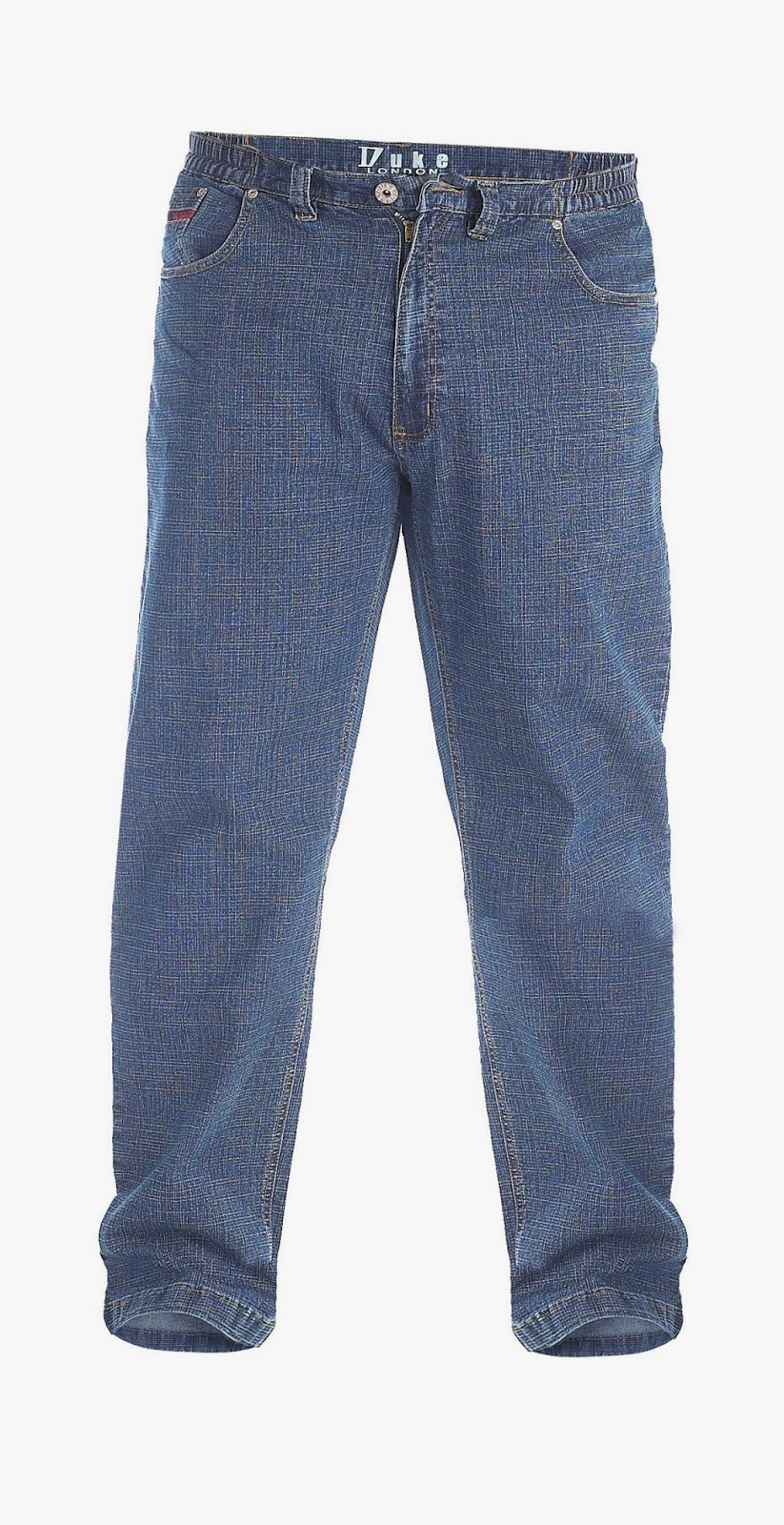


These are the kind of ideal clothes which our characters (protagonists) will wear; throughout the shooting. The characters obviously cannot change the clothes which they wear due to it interrupting the continuity. The clothing chosen are typical pieces of clothing which teenagers usually wear. We found that these pieces of clothing would fit into our title sequence.
Saturday 15 February 2014
Journal - Zombie make - up and first scene with the introduction of a zombie
We managed to find some fake blood which was required for the appearance of our zombie, we did not need to spend a great amount of time on applying make - up and other materials to our zombie due to the zombie is meant to be partially anonymous and discrete - our characters are not meant to be aware of a potential zombie apocalypse in early events. I applied the fake blood to Lauren's face and she interacted (viciously mauling someone in the distance) with Lucy Horton which offered her time and assistance when we needed a zombie to attack a wary person in the far background when our characters would be playing around with the sticks and objects which they find and to pretend to be characters from the Star Wars films, I asked Louis and Aiden if they would make sounds and mention quotations which specific characters state in the films. I took two videos on my phone instead of using my DSLR camera; for the simplicity of my character video recording the friends he is out with. However, the sounds which occur in the two videos will not be heard in our title sequence due to the soundtrack which plays over our title sequence.
 An image of Lauren and the fake blood which I applied to her face.
Wednesday 12 February 2014
Black sails - analysis practice
Black Sails
At the beginning of the title sequence, the sea could connote that pirates are a main part to the television series, dark colours are typically used in pirate films for the simplicity of the immoral times (murder, death, crime, etc). The colours that are used are dark and there is a small piece of light in the centre (could possibly be moonlight) and the text is displayed in the middle of the screen.

An ornament is presented and the symbols which are displayed on the object could convey the following subjects: religion, nationality, class, group or even decoration to the audience.

A ship is presented and there are skulls which could foreshadow death and bloodshed. Skulls are typically used in pirate films to connote danger or death to the audience (usually displayed on sails or flags). Cannons are also displayed and are typically shown on pirate ships, could convey future events (oversea battles/war/mutiny) to the audience, horses are presented in the title sequence could represent travel to the audience.


Skeletons are introduced in the title sequence and it could connote future death or an enemy/threat which lingers in the dark. In one of the shots; the skeleton is behind a female figure, this could convey that the concept is subtle.


Connotations of weapons are used to convey purposes of death and are typically shown to foreshadow the concept of death. The audience can interpret that piracy is a part of the film due to the previous figures of boats and other key features which signify the subject of pirates.


Figures of characters are displayed holding various weapons and all have an aggressive look on their faces; this could represent war and other occurrences which involve specific nations (war between two counties or more).


I like the layout of this image as it shows structures riding the waves; this could convey destruction oversea. In the background there is a character with a piece of material placed over his mouth, this could connote to people that are captives.


A ship is displayed sinking in the sea which could convey to the audience that battles have taken place overseas, could be a reference to pirates sinking otherships. Conflict is presented oversea and on land throughout the title sequence.
The music which is played throughout the title sequence sounds orchestral, bagpipes seem to be playing in the soundtrack; this could convey that the film evolves around Scotland due to bagpipes being a traditional Scottish instrument.
Overall, the title sequence for this television series has intrigued me with the historical concepts which are involved in the title sequence, Connotations of subjects are clearly displayed to convey specific purposes to the audience to foreshadow future events and actions. The music which played gradually grew louder, especially with the drums which played throughout the title sequence. The designs of figures which are presented in the sequence which represent war interested me whilst the music was playing. The title sequence felt strong.
At the beginning of the title sequence, the sea could connote that pirates are a main part to the television series, dark colours are typically used in pirate films for the simplicity of the immoral times (murder, death, crime, etc). The colours that are used are dark and there is a small piece of light in the centre (could possibly be moonlight) and the text is displayed in the middle of the screen.
An ornament is presented and the symbols which are displayed on the object could convey the following subjects: religion, nationality, class, group or even decoration to the audience.
A ship is presented and there are skulls which could foreshadow death and bloodshed. Skulls are typically used in pirate films to connote danger or death to the audience (usually displayed on sails or flags). Cannons are also displayed and are typically shown on pirate ships, could convey future events (oversea battles/war/mutiny) to the audience, horses are presented in the title sequence could represent travel to the audience.
Skeletons are introduced in the title sequence and it could connote future death or an enemy/threat which lingers in the dark. In one of the shots; the skeleton is behind a female figure, this could convey that the concept is subtle.
Connotations of weapons are used to convey purposes of death and are typically shown to foreshadow the concept of death. The audience can interpret that piracy is a part of the film due to the previous figures of boats and other key features which signify the subject of pirates.
Figures of characters are displayed holding various weapons and all have an aggressive look on their faces; this could represent war and other occurrences which involve specific nations (war between two counties or more).
I like the layout of this image as it shows structures riding the waves; this could convey destruction oversea. In the background there is a character with a piece of material placed over his mouth, this could connote to people that are captives.
A ship is displayed sinking in the sea which could convey to the audience that battles have taken place overseas, could be a reference to pirates sinking otherships. Conflict is presented oversea and on land throughout the title sequence.
The music which is played throughout the title sequence sounds orchestral, bagpipes seem to be playing in the soundtrack; this could convey that the film evolves around Scotland due to bagpipes being a traditional Scottish instrument.
Overall, the title sequence for this television series has intrigued me with the historical concepts which are involved in the title sequence, Connotations of subjects are clearly displayed to convey specific purposes to the audience to foreshadow future events and actions. The music which played gradually grew louder, especially with the drums which played throughout the title sequence. The designs of figures which are presented in the sequence which represent war interested me whilst the music was playing. The title sequence felt strong.
Font designs
The feedback from our questionnaires confirmed that the first font is our favourite. However, as a group we think that it is quite boring. We edited the font and played around with it to see if we could make it anymore intriguing.
We decided to try a shadow effect for our title but we desired something else for our title, the colouring around our title (white/grey) makes it look relatively comedic; something which does not suit desired title.

We used the same concept (shadow); we changed it so it was a dark red shadow.
- Aiden preferred this version more in comparison to the others.

we used the same shadow idea to create another rough design, we changed the shadow colour to a dark grey.
- Louis preferred this design.
In comparison to the fonts which our group has designed, I have decided that the font with the grey shadow effect is my favourite.
- Lauren is uncertain on which font she prefers.
Post #2 - Production company

Codes and Conventions:
- Low key lighting
- Faint images
- Foreshadowing death/bloodshed
- Isolation
- Scenary - rural
- Foreshadowing
- Psychopath/killer - glimpse of character
- Equilibrium
- Knife - foreshadowing - physical weapons
- Medical imagery - experiments
- Dark clothing - not suits, jeans, T-shirts and trainers
- Orchestral music
- Scrape like sounds - intensify the audiences move
- Connotations of blood
- Connotations of weapons
- Slow paced editing - enable the audience to observe specific elements for longer durations (slow motion)
- Hand held footage
- Hand held - shaky - unbalance
- Close ups - weapons - scenary - etc
- Tracking
- Point of view shot
- Low angle (worm eye) and high angle shots
- Pan movement
- Establishing isolation


Tuesday 11 February 2014
Font notes
During class we had a discussion about different font types and a class analysis of the following title sequences: Catch Me If You Can; Lord of War and Forest Gump. We included the conventions of each title sequence which have linked connotations which unveils a synopsis to the story and the metaphors used which gives specific parts of information away to us as an audience. We noted the specific region of where the title sequence credits is established and positioned. We found the discussion useful for further research as we learned and became more familiar with the concept of title sequences.
Forest Gump
Catch Me If You Can
Lord of Way
Forest Gump
- The colour white - the feather - purity
- Large font - centered - traditional
- Quite plain
- Soft and tranquilised
- Newsprint
- Fades in
- Serif font
- Slow paced - calm - steady
Catch Me If You Can
- Two different fonts represent two different characters - personalities - roles
- Font sizing and clarity - easy for the viewer to read
- The font changedand transitioned0
- Saul Bass (colouring, projectile lines)
- The concept of constant movement - fonts link with the film - characters
Lord of Way
- Fonts/writing - war time - serious
- Main characters names presented in the centre, cast and crew appear at the side
- Metal printing
- Large fonts - centered - names, etc
- Emotionless, serious - relation to war
- White coloured fonts
- Dark background

Monday 10 February 2014
Saul Bass
Saul Bass
1) Saul Bass - (1929-1996): American Graphic Designer who became famous for his work in film and classic logo design.
2) Best known for his simple, geometric shapes and their symbolism.
3) Often a single dominant image stands alone to deliver a powerful message.
4) Studied design and at Art Student League at Manhattan.
5)His posters had an uncanny ability to capture the mood of a film with simple shapes and images (started with poster design).
6) His shapes and art work was usually hand drawn.
7) His messages were quite generic but sophisticated.
8) His shapes were hand drawn by Bass to create a casual appearance; always packed with a sophisticated message.
9) Bass created visual metaphors/stories to intrigue the viewer and to give a synopsis or reference to the film by using visual images to create a short story to convey specific key pieces of information to the audience instead of written information. He revolutionised the way people viewed title sequences/credits (pictures, cut - out projectiles - conveys synopsis to the viewer).
West Side Story - Complements music - leads to an image of the main location, through the duration of the music; lines appear which eventually creates the full image (simplicity of location).Abstract.
Quotation - "I want everything we do to be beautiful. I don't give a damn whether the client understands that that's worth anything, or that the client thinks it's worth anything, or whether it is worth anything. It's worth it to me. It's the way I want to live my life. I want to male beautiful things, even if nobody cares." - Saul Bass
Friday 7 February 2014
Group research - sounds
- We found some uncopyrighted soundtracks on youtube, we were thinking about adding one of the soundtracks or even layering two soundtracks to create a remix of sounds for our title sequence. We would prefer our soundtrack to correlate well with our title sequence; considering and conveying the necessary elements which we desire to attain.
- We have also considered sounds for our zombies; we have considered creating our own zombie sounds for our title sequence.
- The zombie makeup tutorial video is an asset to our project; the contents have shown us the required parts we would require for our title sequence. (The veins, dark shadowing, boils, blood - these are the things we would want our zombies to have - appearance).
I was looking into music for horror genre; I found this example of rock being used instead of orchestral music for the opening cinematic for this particular video. However, this video is an extract from a game not a film or television series. The song is by 'Avenged Sevenfold' the song name is 'Shepard of Fire' - Synergy is used between the band 'Avenged Sevenfold' and the game Call of Duty: Black Ops 2 (the companyh for this game produces zombie mini games and particularly used rock music instead of orchestral for their initial game play.
Codes and Conventions
Codes and Conventions:
- Low key lighting
- Faint images
- Foreshadowing of death/bloodshed
- Isolation
- Scenary - rural
- Foreshadowing
- Psycopath/killer - glimpse of character
- Sets Equilibrium
- Knife - foreshadowing physical weapons
- Medical imagery - experiments
- Dark clothing - not suits, jeans, t-shirt and trainers
- Handheld footage - intensifies the particular area for the audience
- General slow paced editing - longer duration of time for the audience to observe specific characteristics
- Orchestral music
- Scrape like sounds - dissonant sounds
- Words scraped - engraved into materials - suggests or foreshadows something
- Connotations of weapons
- Connotations of blood
- Hand held - shaky - unbalance
- Close ups - close ups of weapons, characters (abstracts of character qualities)
- Tracking shot
- Point of view shot
- High and low angles
- Birds eye view
- Worm eye
- Pan movement
- Establishing shot

Group Feedback
As a group we sat down with out teacher and discussed the contents of our individual blogs. We have a small list of improvements which we need to consider for our blogs. We spoke about our film concepts; leanne gave us some ideas what we could possibly add to our film.
Group Feedback/blog feedback:
- Begin storyboarding
- Add the label gadget to our blogs and correct our posts in chronological order.
- Create a slideshare account for future posts which may consist of PowerPoints, presentations, documents.
- Research into makeup and costumes for zombies (backgrounds etc). Find out how to create fake blood.
Thursday 6 February 2014
Lady In the Lake
Lady In The Lake (1947)
This title sequence reminds me of the title sequence from Napoleon Dynamite; they both share one contrasting similarity with their title sequences. Napoleon Dynamite presents the illustrations (text/fonts) over plates with food. The title sequence for this particular film (Lady In the Lake) has two people taking pieces of card (a male and a female character - the appearance of the hands gives away the gender for the characters) which displays the text upon the card.
I can deduce from this title sequence that the film is meant to be set around the event of Christmas due to the connotations of reindeer's and the montage of carols which are sung throughout the title sequence. The typical visual images also convey and reinforce the ideology of the film being set around the event of Christmas; increasing the significance of the concept through visual effect. The background on the pieces of card presents snow covering structures; households. There are other visual images displayed which have reference to Christmas throughout the title sequence.
Near the end of the title sequence, the music turns from a joyful and festive tone to a darkened and more sinister complexion. The melting candles could possibly connote time which has an effect on specific characters. A gun is displayed and could foreshadow future death which could give away a huge part of the story to the audience. The gun conveys death and the audience would of been noted about a future killing. Some of the lyrics in the soundtrack connote references to situations and future circumstances which characters may stumble across in future events of the film
Wednesday 5 February 2014
Sunday 2 February 2014
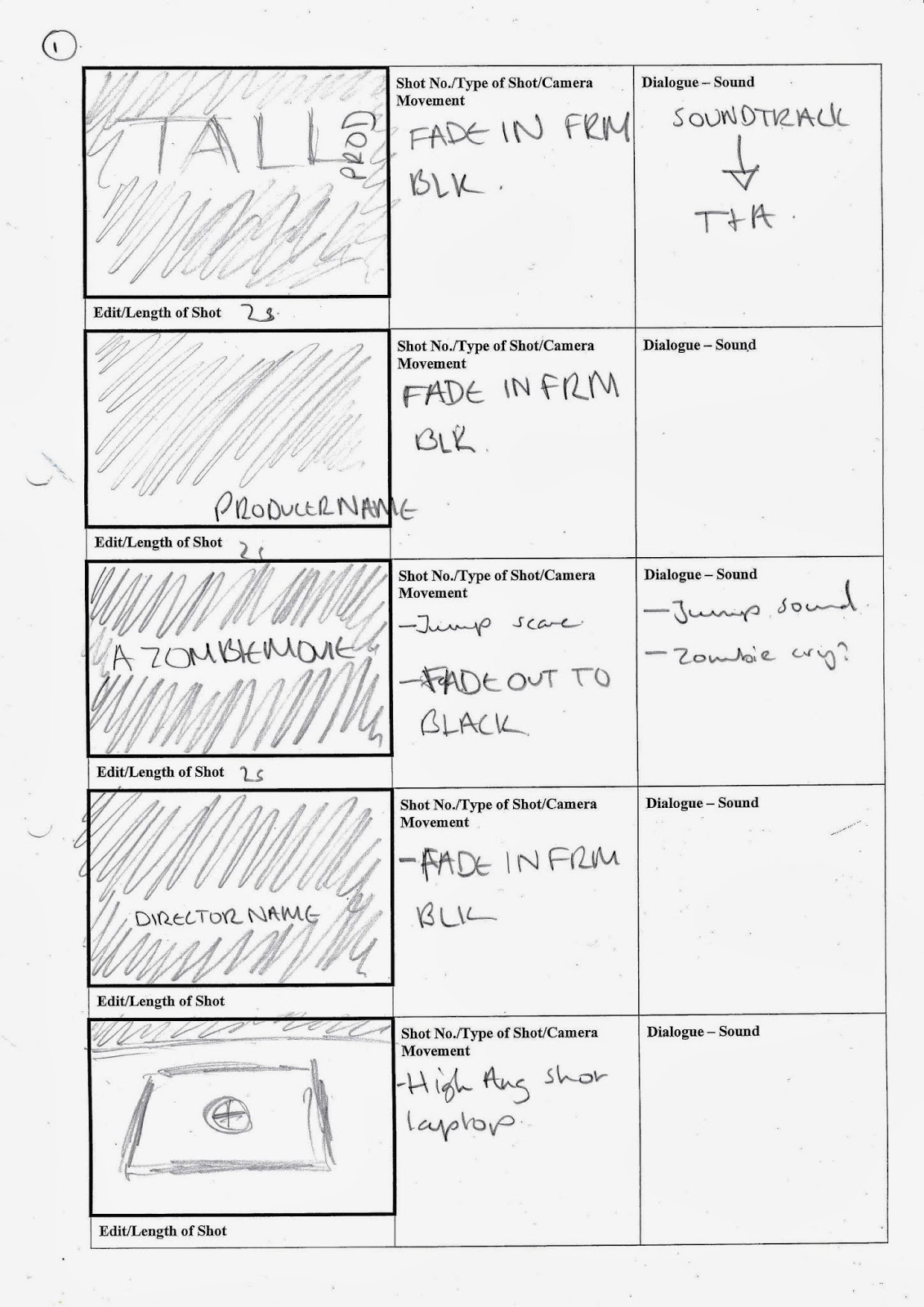
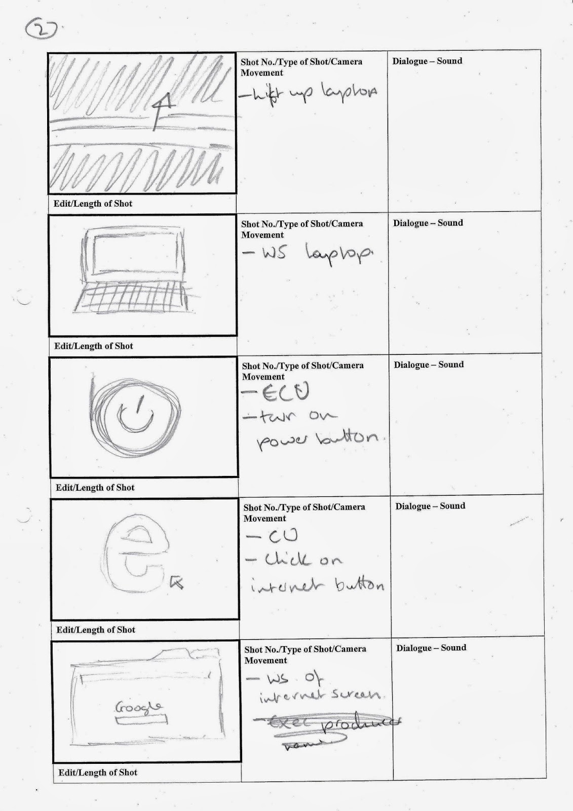
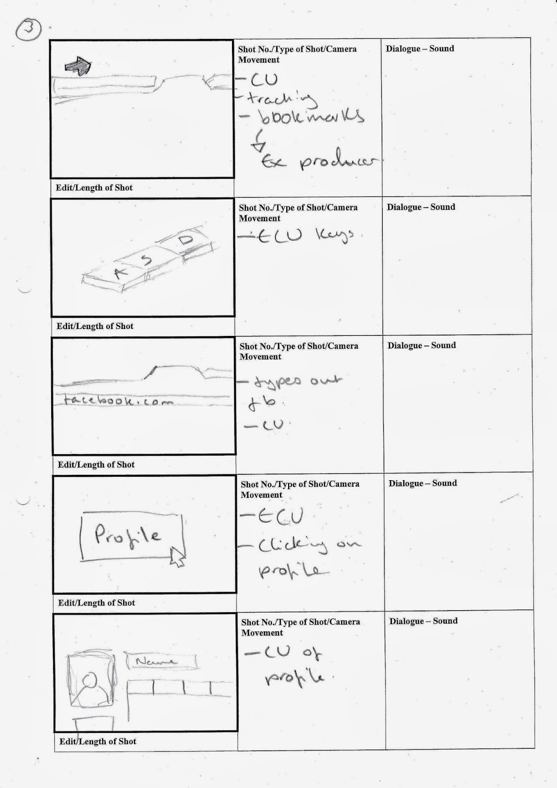
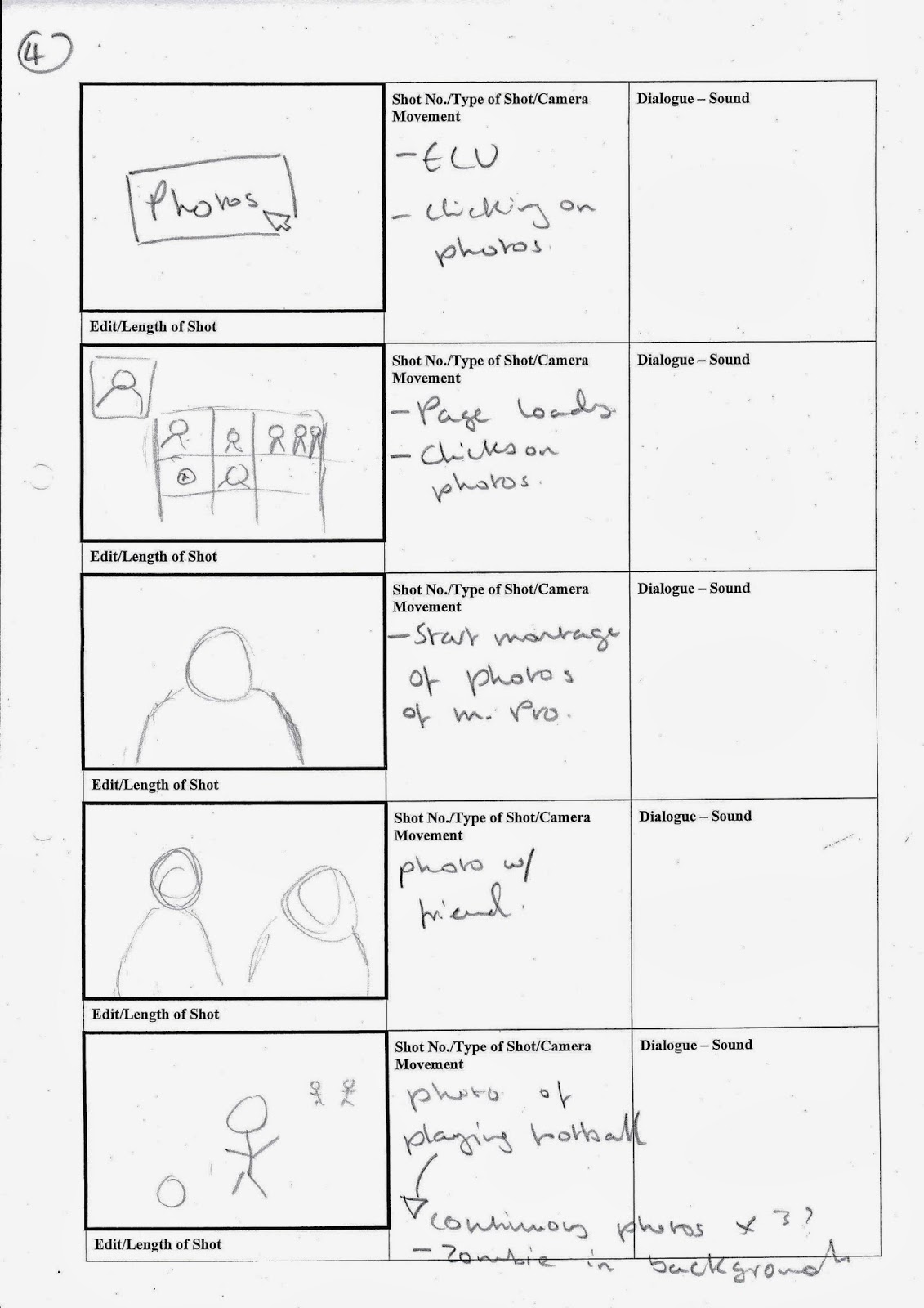
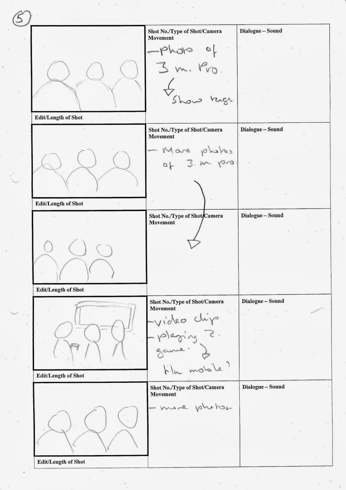
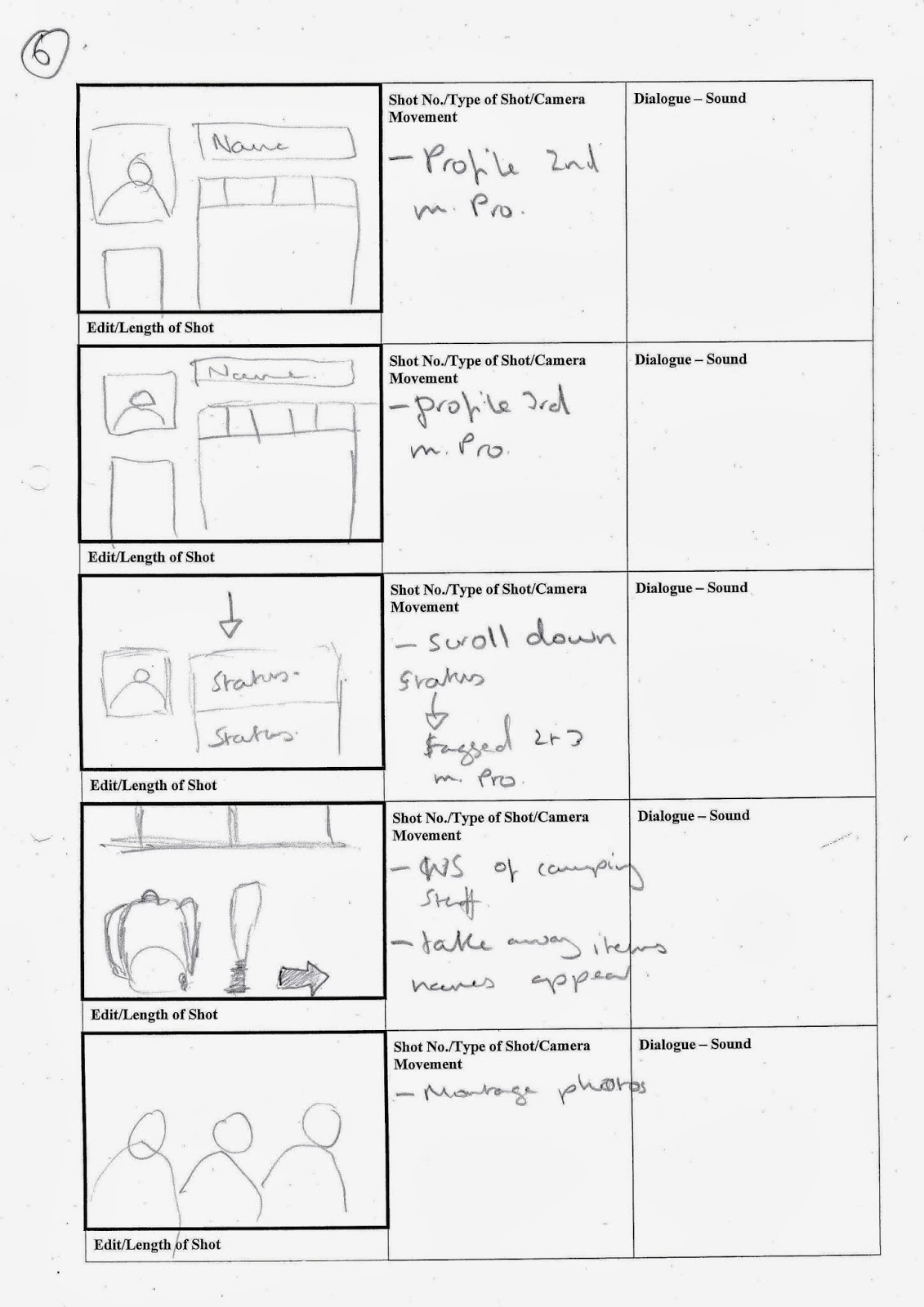
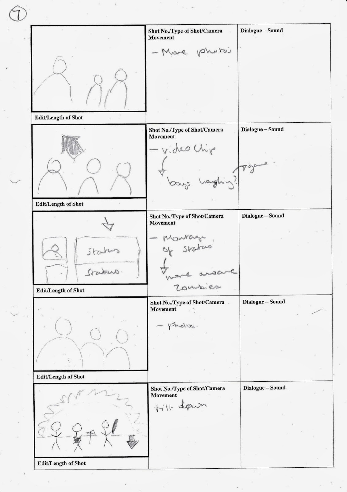
Storyboarding
This is the second draft of our storyboards for our title sequence that we completed in Emily's class. We also spoke of preproduction plans and creating a schedule for which thing should be completed by and what we should be doing during the holidays filming wise.
Subscribe to:
Posts (Atom)