The feedback from our questionnaires confirmed that the first font is our favourite. However, as a group we think that it is quite boring. We edited the font and played around with it to see if we could make it anymore intriguing.
We decided to try a shadow effect for our title but we desired something else for our title, the colouring around our title (white/grey) makes it look relatively comedic; something which does not suit desired title.

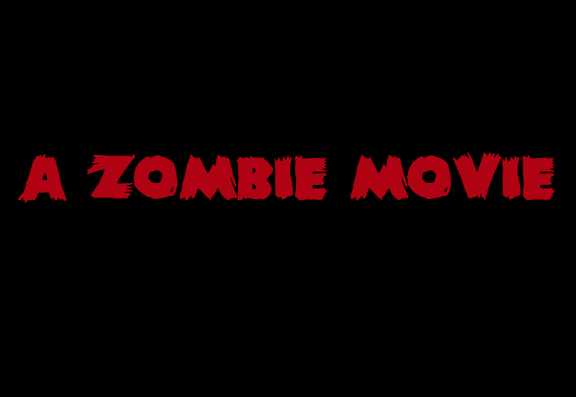
We used the same concept (shadow); we changed it so it was a dark red shadow.
- Aiden preferred this version more in comparison to the others.

we used the same shadow idea to create another rough design, we changed the shadow colour to a dark grey.
- Louis preferred this design.
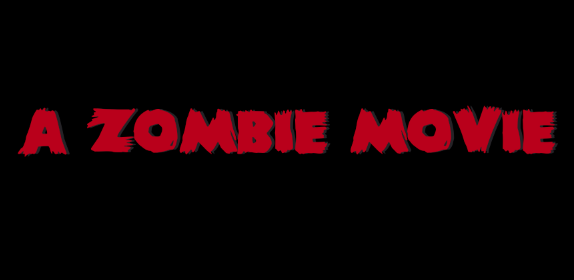
In comparison to the fonts which our group has designed, I have decided that the font with the grey shadow effect is my favourite.
- Lauren is uncertain on which font she prefers.
No comments:
Post a Comment